Advertisements
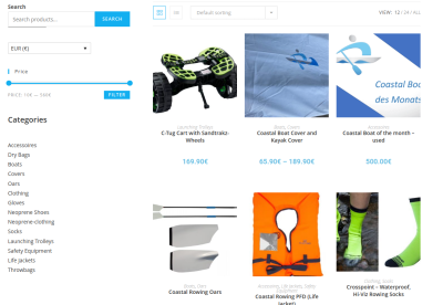
Well, you can all see the new design that we’ve put up for Rowperfect’s website. Taking our new logo we felt it warranted a bit of attention and some more ‘beautification’ and simplification in the site layout. Apart from the colour changes, we’ve also widened the layout to accommodate modern high resolution screens, added in a new home page layout including links to pages designed for coaches and coxswains. Please comment below with any bloopers, feedback and opinion.
Advertisements


